When checking out, the page assumes the user will check out as a guest. The checkout flow by default, does not force the user to login or create an account. When filling out the form fields, email is listed with an asterisk so the user will be aware that this information is mandatory to complete on the page.
Redesigning a Recipe App in Five Days - Google Ventures Design Sprint
By Jennifer Christensen
SAVR Recipes is a startup company. Their mobile app allows users to find recipes, and rate and review them for other users. I was brought onto this project as the sole designer and I was provided the following resources: prior research findings, a persona, and a recorded user interview.
Process: Modified Google Ventures design sprint
Main goal: Create a more convenient way for users to easily follow recipe steps and cook a successful recipe at home.
Timeframe:
This was part of a Google Design sprint, so all of my work from start to finish, spanned five days.
My Role
Tools Used
Constraints/Challenges
I was the UI/UX Designer. Research about the problem was already conducted, so taking that information, I began sketching possible solutions, performing usability testing, and creating hi-fidelity final designs.
Figma, Zoom, pen/paper
-
Solution must be a feature inside the SAVR Recipes mobile app
-
Current cooking steps are written as text, ordered from start to finish
-
I had five days to work on this project and ultimately produce a working prototype
Research was Already Done to Identify the Main Problems:
1. Users are unsure of what their recipe should look like, at various steps in the process
2. Unclear instructions and cooking steps
3. Since users need to use their phone while cooking, they stated they need to wash their hands frequently. It’s annoying and inconvenient.
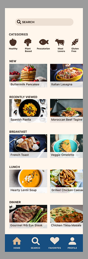
< Hi-Fidelity sketch of the finished home page
Solution - Add a Video Component for Additional Audio and Visual Clarity
Once on the recipe page and moving through cooking steps, users do not need to scroll at all. Any actions and navigation can be done with a tap. This lessens the hand-to-phone contact during the cooking process, when users may have their hands busy.
Videos of each step in the process are included directly on the same screen with the steps, in order. The videos of each step are on a loop, playing until the user goes to the next step. This allows the user to see exactly what the recipe should look like, at every step. The video audio will eliminate the need for some users to put their hands on their phone.

Day One - Understanding the Problem
First I researched the existing SAVR Recipes app, read information about the users, and listened to the provided user interview.
Additional Insights/Problems Found From the User Interviews:
-
If there are techniques or unknown words in the cooking instructions, users need to stop and look up those words
-
Users want to know how many pots/pans are needed ahead of time, to minimize cleanup
-
Multiple statements were made regarding timing - such as foods not being ready at the anticipated time, needing to wait 20 minutes before starting the next step when the user could have started something else, etc.
How Might We:
-
Provide clearer cooking instructions
-
Reassure the user at specific points in the process, how the recipe should look
-
Help the user to prep all ingredients before the cooking starts, and efficiently use time
-
Create a more hands-free experience to reduce the need for physical contact with a phone, while cooking
User Map
I created a user map to organize my thoughts about the main flow I would be designing, to help the user achieve their goals and solve the problems that were identified.

Day Two - Sketching and Lightning Demos
Lightning Demos - I looked at mobile apps that featured recipes or helped users with cooking steps. I also noted any that used a video component, and evaluated the functionality.
1. Kitchen Stories App
Things I Liked
Things I Did Not Like
-
The user enters a 'Start Cooking' mode and images are available for each step
-
Videos are available for additional elements aside from the steps - for example, a video about how to dice an onion
-
No videos are available to show the cooking process for the entire recipe


2. Tasty App
Things I Liked
Things I Did Not Like
-
The user enters a 'step by step' mode with videos on a loop, so the user can see what the dish should look like, at every step in the process
-
No videos are available to show prepping steps


3. Side Chef App
Things I Liked
Things I Did Not Like
-
Ability to use voice commands
-
Photos and cooking instructions are available on the same page in 'step by step' mode
-
Videos are not available for the actual cooking steps, only for small additional items or prepping things
-
Play button on the videos was unclear. I almost overlooked the button
-
The main idea of the app seems to be buying the ingredients and showing the nearest store they are available - this is interesting, but not relevant to any problems the users stated in the research phase


Overall Thoughts After Reviewing Competitor Products:
A video component would allow users to see the recipe at all times, at all steps in the process. I should explore having a specific video for prepping and separate videos for cooking steps. Most of the competitor products have either one or the other - not videos for everything.
Most of these apps have separate areas to ‘enter’ the cooking step modes, after the user is already looking at the recipe page. Entering the cooking mode gives a more interactive experience with visuals of each step along with instructions.
Crazy 8's Exercise
Using the crazy 8’s method, I set a timer and rapidly sketched 8 ideas for the main recipe screen. The purpose of this, is to quickly get ideas down on paper.
Next, I needed to choose a solution to move forward with. I studied the 8 sketches, thinking about how the user would utilize these screens. Instead of choosing only one of the 8 options in the crazy 8's exercise, I took the 'best' elements from multiple boxes on the page.
Many users said in interviews that they wasted time during cooking, because they could have spent time prepping items beforehand, if they had known ahead of time. Therefore I wanted to have separate videos for prepping and cooking.
I thought about putting cooking steps directly on the recipe screen, and the user would need to scroll down. But that’s inconvenient, especially if a user physically has their hands full while cooking.

Critical Flow in the Solution - Choosing a Recipe and Viewing the Steps
In the research phase, it was discovered that users did not have trouble navigating to the recipes themselves. The issues arose when the cooking was actually taking place, and the user was following directions. Therefore the most critical screens would be the recipe screen, and wherever the cooking steps are listed for the user.
1. Home Screen - List of recipes and categories - Has a search bar at the top and navigation items at the bottom. The user selects a recipe here.
2. Individual recipe screen - The user can view cooking time, see reviews, read ingredients and equipment needed, see related recipes and videos, and watch either prepping or cooking steps.
3. Video with step one playing, and the cooking steps below it. A progress bar appears at the bottom, letting the user know they are on the first step but there are 4 steps in this recipe in total (4 bars).

Day 3 - Decide
How I decided to proceed with this solution:
Formatting the recipe screen into two columns saves more space on a mobile device. During the research phase, users said they wanted to see the equipment/utensils used, accurate cooking time, and the ability to save time by prepping things at appropriate points in the cooking process.
Separate prepping and cooking videos ensures that the users can see what the recipe should look like from start to finish.
My Storyboarding Process
To understand how users would move through the flow of finding a recipe and cooking it, I created a storyboard.
First, the user finds their recipe. Once the user clicks either the prepping or cooking video on the recipe page, the step 1 video will play on a loop until the person clicks ‘next.’
The steps are clearly visible along with ingredients, so the user can see the steps and also see what the recipe should look like at that point. I wanted the video to repeat on a loop, so users won’t need to physically touch their phone frequently while cooking.
If certain prepping/cooking steps use unfamiliar phrases, such as "dicing" an onion, a related video may appear on the screen during the flow of the steps. The video may be titled, “how to dice an onion.” This is optional but the user can watch these educational videos if needed.

Day 4 - Prototype
Since this project involved designing a specific flow, I created a simple interactive prototype that only involved the home screen, getting to the recipe, and the recipe steps/flow itself.
Since I wanted to use many photos and videos for the recipes (and they could be any color, depending on the type of food) I first created black and white wireframes. I did this first to make sure I got all the elements/components on the screens first, before thinking about color.
Below: Rough wireframe of the main flow for navigating through the recipe steps.
In the sketches, the cooking steps were included on the recipe page as well as subsequent pages. Moving forward with the wireframe, the user clicks either 'watch prepping' or 'watch cooking' to enter the area with steps/directions. No steps are on the recipe page now. This ensures the user does not need to scroll too much.
I realized I forgot to add a 'back to recipe' button on the final screen here in the wireframes, so in the final prototype I added a button for that.

After, I needed a simple color palette, but I did not want to copy the competitor products’ style. A lot of recipe apps utilize black and white for the palette, so I decided to use a cream color with brown and tan neutrals.

Below: Main flow for selecting a recipe and following the steps to completion (first draft)

Day 5 - Validate and Test
I conducted one round of remote usability testing with five participants using recorded screen-sharing through Zoom. For the main task I asked what they would do, if they wanted to cook a lasagna from start to finish.
Participants
-
All had at least some experience with cooking at home
-
Regularly use smartphones
-
Cooked frequently and had experience following recipes found online or through apps
My Testing Goal
Determine the ease with which users were able to follow a recipe, using this prototype. I wanted to ensure there weren’t any confusing areas, and if the users had any feedback about the design.
Findings From Testing
All users were able to correctly navigate to a lasagna recipe, from the home page.
All users clicked appropriate buttons for accessing the recipe steps and videos.
Main Problems Found
-
Four out of five participants said the instructions/equipment shown on every step was redundant, or that it looked a bit lengthy/overwhelming to read.
-
One user mentioned that once they are inside the steps, they need to keep clicking ‘back’ a few times to get out of the steps, and back to the recipe. This requires many clicks to get out of the steps, if the recipe is long.
-
Inside the steps, there are bars on the very bottom of the screens to indicate how many steps are left in the process. These were not ‘fixed’ within the prototype and the user would sometimes need to scroll down to see this.

Positive Feedback
-
Multiple users praised the lack of an ‘article’ on the recipe page. Sometimes on apps and sites, paragraphs of text are displayed, telling a story about the recipe - when in reality, the user just wants to quickly cook the food.
-
Participants enjoyed seeing the ‘related videos’ when they are related to the directions. One user said she usually needs to google this information anyway, so having it inside the app is convenient.
-
All users were able to successfully navigate back to the home screen from anywhere, including once they were inside the cooking steps. (I was wondering if this would be problematic because the main navigation bar does not appear anymore once the user is inside the flow with the cooking steps).
Revisions and Final Prototype
-
To address the redundant instructions/equipment on every screen, I shortened those cards and faded the text. On many mobile apps this fading indicates that the user can click to see more, so the information could appear and the user would scroll down to see the full info. Although I was unable to do a second round of usability testing, my hypothesis is that users will attempt to click these cards if they want to view more information.
-
I made sure the progress bar at the bottom of the cooking steps, was ‘fixed’ to the bottom, in every screen of the prototype where it appears.
-
Inside the steps, where applicable, I added an x in the corner so users can directly go back to the recipe screen. This eliminates the issue of clicking ‘back’ multiple times within the steps, just to get back to the recipe screen.
Below: Revised flow for selecting a recipe and following the steps to completion (final draft)

Possible Product Vision for the Future
I’d like to explore the possibility of adding voice commands to enable hands-free use of the SAVR Recipes app. This would help users with soiled hands who are in the middle of cooking.
Reflections and Conclusion
This solution solves all of the main problems found during the research phase, and addresses the How Might We statements.
How might we:
1. Provide clearer cooking instructions
2. Reassure the user at specific points in the process, how the recipe should look
3. Help the user to prep all ingredients before the cooking starts, and efficiently use time
4. Create a more hands-free experience to reduce the need for physical contact with a phone, while cooking
All users were able to navigate successfully to each area of the flow during their testing tasks. No users experienced much confusion during the process.
What I Learned:
This was my first attempt at performing a Google Ventures design sprint and I learned a lot of new techniques (such as the crazy 8’s exercise). At first I was apprehensive as to how I would design and test a flow in only 5 days. This project showed me how simple it can be, and how I can efficiently use my time.
I learned more about time management during the design process, and the idea that something is better than nothing when it comes to testing. For example, this was my first design that involved a video component. If I had more time, I would have tried to include real cooking videos, directly inside the prototype for users. That way, during usability testing, the prototype would be much closer to the reality of what a user would be seeing inside the app.
When pressed for time, the prototype doesn’t need to be perfect - it just needs to communicate ideas to the user efficiently. This was a valuable lesson to learn, because it’s easy to get carried away trying to create ‘perfect’ details in a design. We must always remember the big picture.