When checking out, the page assumes the user will check out as a guest. The checkout flow by default, does not force the user to login or create an account. When filling out the form fields, email is listed with an asterisk so the user will be aware that this information is mandatory to complete on the page.
Household: Creating a Smart Plug App
from Scratch
By Jennifer Christensen
What is Household and What Problem does it Solve?
Household is a mobile app for smart plugs, which are devices that plug into an electrical outlet. Using WiFi functionality, information about energy usage and estimated electricity cost from that electrical outlet, is funneled into the app.
This information informs people about their home energy use.

Main Problem:
The Solution:
Users want to see how much money each individual home appliance costs, and this is NOT something other smart plug apps can do (at the time of this publication).
-
An app with all the same features as the competitors
-
Can also track estimated cost based on the user’s home location/energy provider.
My Role:
Sole UX Researcher, UX Designer, Information Architect, and UI Designer
Timeframe/Tools:
-
January 2022 - April 2022
-
Tools: Figma, Miro, Marvel, Zoom, pen/paper
Users:
-
Homeowners interested in saving money on energy bills
-
Renters who are students/young professionals, looking to save money
Discovery Phase
What makes this smart plug design special?
During the discovery/research phase, I found there are no smart plugs that track estimated cost (at the time of this publication).
So...why does this not exist yet?
Time of day/weather/change of seasons can all affect the cost of energy. Example - running your dryer is more expensive in the evening, when more people are running their appliances.
Energy providers would need to make their ever-changing pricing/cost data available for an API to capture this data. I believe there is a big opportunity in this space.
Is there a demand for this?
Yes! First, I conducted semi-structured interviews. Most participants stated that saving money was the number one reason why they wanted to track their energy usage.
They stated it would be helpful to see the estimated cost of each appliance.
Smart Plug Competitors:
.png)
Affinity Mapping - Documenting Discoveries from User Interviews

Using Miro, I created a color coded affinity map to document the main discoveries from the semi-structured interviews. I played back the recorded interviews and read my notes to find patterns.
Each individual color corresponds to a different participant.
By color coding them, I keep track of how many people made statements about the same item.
Discoveries From Interviews and Affinity Mapping:
Why?
Saving money was the number one reason why people wanted to track their energy usage.
What?
Most people wanted to track energy use per appliance - to see how much money each appliance was costing them.
How?
Most people wanted to track energy usage via a mobile device for convenience.
Personas
Personas were created to understand the users' motivations and needs on a deeper level.
Two main categories emerged:
Married homeowners and unmarried renters/young professionals


Minimum Viable Product
In interviews, most users described two functions they were accustomed to using with competitor smart plug apps:
-
Scheduling the plug on/off for a future time
-
Turning the plug on/off directly from their mobile device
Therefore, the solution needed to have these same features as competitors, plus the additional ability to track the estimated cost of each appliance.
Design Phase
Sketching Red Routes


First Sketches - Adding a plug and filling out the profile information
Main problem:
People want to track how much money specific appliances are costing them.
How I solved this:
First, I sketched a few ideas of the red routes (adding a new smart plug and filling out the user profile) to quickly begin the design process.
-
Pie chart on the home screen, showing how much energy each individual smart plug uses. There's a quick view of the daily cost in dollars and daily energy use in kWh (kilowatt hours).
-
In my first round of sketches, users can click each smart plug to see the individual cost and energy use, per appliance. There are reports for viewing metrics like weekly and monthly usage.
Validation Phase
Guerilla Usability Testing (Sketches)
To ensure users understood how to navigate the app, I performed a round of guerilla usability testing with my sketches, using Marvel’s POP (prototyping on paper) app.

1st Insight from Testing Sketches:
"Rename" button was confusing to users
The name of the smart plug does not appear on this screen, so when people added a new smart plug, they weren’t sure where the new name would appear, once it was actually renamed.
2nd Insight from Testing Sketches:
On/off toggle button was confusing. Most users could not tell what it was in the sketch.
Wireframes and Guerilla Usability Testing
Next, I created wireframes of additional flows/screens, and wireframes of the screens I previously sketched. I performed guerilla usability testing.
The purpose:
-
See if minor revisions would solve the issues found during the sketch test
-
Identify any new navigation issues with the wireframes
Issues identified during wireframe testing:
-
"Rename" button still caused confusion. Even though I added the plug name in the success message header, they still did not see a clear place on the screen where the name would appear, if they clicked this “rename” button.
-
Some users understood what the on/off toggle button was (in the center of the screen), but some were still unsure of what the button was for.
-
My prediction: Adding color to the toggle button would reduce confusion.

Wirfeframe of the 'adding a plug' flow. Illustrates the 'rename' and on/off functionality
I decided to create a wireflow to understand the interactions users would have inside the app when performing important functions.

Hi-Fi Design and Validation Phases
Moodboard and Style Guide
.jpg)
Hi-Fidelity Prototypes and Testing
I performed two rounds of usability testing using prototypes in Figma.
Main Goals:
-
Ensure users could navigate to all parts of the app
-
Complete basic red route tasks
-
Identify any remaining points of confusion
The main areas that changed between rounds 1 and 2:
-
Navigation
-
Renaming Feature
-
On/Off Toggle
-
Scheduling
.png)
Hi-Fidelity Version One - “Rename” and On/Off Flow (Final Design)
Changes in Version 1 that Worked:
-
“Rename” function is understood by users, with the name of the plug directly in the screen's header.
-
On/off toggle is clear to users, with orange meaning “on” and grey meaning “off.”
Problems with Version 1:
-
The bottom navigation button prompts the user to go “home” in order to enter many other areas of the app. The user cannot see all navigation options from all screens.
-
No all icons are clearly labeled

Hi-Fidelity Version Two - “Rename” and On/Off Flow (Final Design)
Changes in Version 2 that Worked:
-
Each plug is visible from the home screen; now there is no need for a separate screen for each plug. Users click into each plug and the information drops down, similar to an accordion menu.
-
The bottom navigation bar is now visible on all screens/icons are clearly labeled.
-
“Rename” function is essentially the same, and the toggle on/off icon is still colored orange for “on” and grey for “off.” Users performed tasks without difficulty.
Scheduling Version 1 - The Most Problematic Feature
Users can schedule a plug to turn on/off at specific times of the day, or only on certain days.
Every participant experienced some confusion when using this feature, and it was the most problematic item during usability testing.

A hi-fi image of the original scheduling feature
Why did I choose to design the scheduling feature this way?
For inspiration, I looked at other smart home technology scheduling features. In the Google Nest thermostat, users can click to generate a bubble on a grid, and drag it up/down to select a higher or lower temperature. I thought this was cool and interactive. But when I designed similar functionality for my own app, it just confused people.
During testing, many users said they preferred to input a specific time. One user even said she wanted it to look similar to Apple’s alarm clock app.

Image from the Google Nest Scheduling Feature
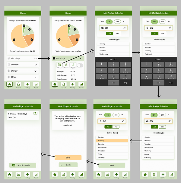
Scheduling Feature: Final Design
Based on user feedback, I redesigned the scheduling section to include a clock-style screen in which the phone’s keyboard automatically pops out, prompting users to input a time.
All users successfully completed this flow with minimal questions or problems.
%20hi-fidelity%20capstone%20one%20for%20case%20study.png)
Hi-Fidelity Version Two - Scheduling Feature (Final Design)
Overall, the Main Goal was Accomplished:
Create a minimum viable product (MVP) to track a user’s estimated cost of energy per household appliance, and make it easy to use.
Product Vision for the Future:
Based on feedback during usability testing:
-
Scheduling screen - Add an “edit” button so users can edit any existing schedules they already created. Otherwise the users need to delete the schedule and create a new one.
-
Scheduling screen - Add an option to select all days in one click. Otherwise users need to click 7 times (once for each day of the week) if they want to schedule the plug for every day.
-
Reports - Allow more than three months’ worth of data to be shown at once.
Lessons Learned:
-
From the scheduling feature, I learned just because a large company like Google is using a specific type of functionality, that does not mean the functionality is right for your own product. You don’t need to reinvent the wheel, and sometimes a simple solution is the best solution.
-
This was the first project I designed end-to-end by myself - doing the research as well as the designs. I made a few “rookie” mistakes but I definitely learned the importance of understanding “why” behind every design decision.
-
Since I was the sole designer, I also reached out to fellow designers for feedback a few times during the process. This reminded me of how helpful it is to work as part of a team. It’s really nice to have people to bounce ideas off of. It’s important not to get stuck in your head too much, and to always think about the big picture, in addition to the small details.